The Power of Neutral in Health Club Color Schemes

When it comes to design, equipment with low-key colors can play a key supporting role in any visual scheme.

In multi-hued clubs, equipment can be a focal point and send the right message to your members.

While it may seem counter-intuitive, neutral colors can be a great support for the rest of your design. In interiors, neutral tones can be used in a variety of applications. They can cool a space down, create depth, and even invite comfort. It all depends on how you use them.

Neutral colors often take on characteristics of the other colors in a palette and can be used to reinforce those influences. The basic neutrals include black, gray, white, brown, and beige. In the right context, gray, for example, can be seen as sophisticated and powerful. It’s one of the most flexible neutrals, as it can be seen as warm or cool, or traditional or modern.

Black is generally considered timeless and sophisticated, and a great partner to almost any color. It makes other colors appear brighter. Even very dark colors can work well with black when texture differentiates them. Depending on the space, black’s ability to absorb light can make walls recede and rooms look larger. It can be used to ground elements in a space or create gorgeous, elegant contrast.
Supplier content colorway precor logo limited use column

The Role Equipment Can Play in Design

It can be argued that equipment with neutral colors better fits an overall design theme.

“Equipment colors are secondary to the larger overall design theme of the brand color platform,” notes fitness facility designer and gym brand architect Cuoco Black. “Developers have one of two options in addressing fitness equipment colors: They can blend the equipment colors into the brand aesthetic or they can entirely ignore the equipment colors making them a design-non-event. It depends entirely on the larger marketing and design intent of the owner.”

Neutral colors like ash, storm gray, tungsten, and pewter can also help in spatial perception. Black calls these “achromatic” colors and says that they do not fall within the visible spectrum of light.

“Think in contrast to the colors you saw when testing prisms in school,” he says. “They don’t have physical wavelengths. I would, however, consider them at least neutral colors for gym-design lay-purposes. In contrast to the millions of visible colors along the spectrum of light, these colors have an arguable role, which can be beneficial, in a theory for spatial perception.”

Along with its impact on facility design, color affects the appearance of the equipment itself.

“Commercial fitness equipment is often large in scale; this is an indisputable fact,” relates Sean Horita, senior industrial design manager at Precor. “The strategy for color breaks is to accentuate the flowing lines of the equipment, connecting the front with the back and identifying the user or exerciser 'zone', and to do so in a way that complements the scale of the machine.”

Supplier content colorway precor elliptical limited use column

Color breaks, he adds, can have the effect of reducing the apparent size of a product, making it less monolithic, and providing a foundation for other colors, materials, and finishes. “Everything has to play well together for this to take place, and we do an unbelievable amount of design and testing of color iterations before qualifying it for production.”

Bringing Neutral Front and Center for Equipment

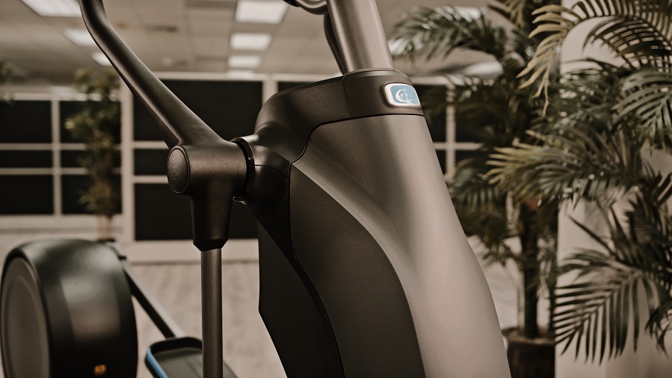
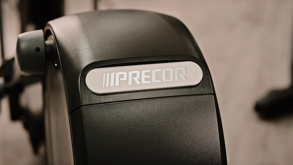
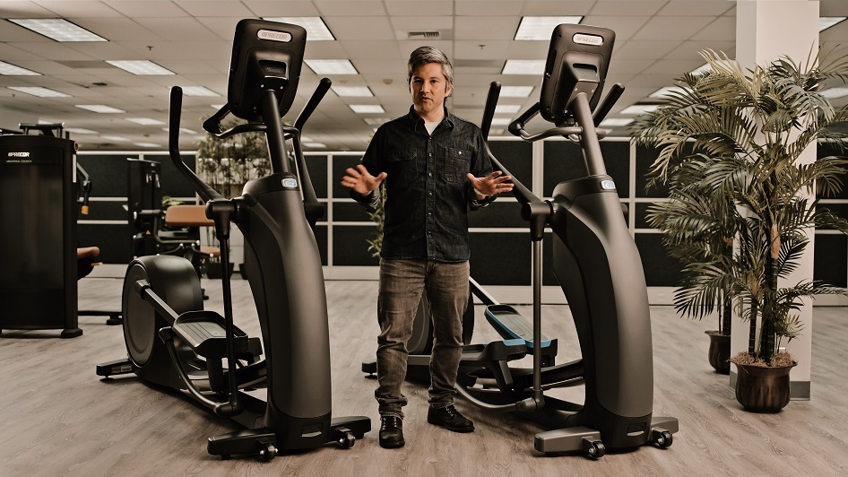
Recently, Precor introduced new cardio equipment colorways, based on black and gray colors, which differs from its existing color schemes.

“The new options focus on the distinctive silhouette of our equipment,” Horita explains. “It was the first time presenting what we call a ‘Dark’ palette, which was in response to trend awareness coming from Europe. The dark colorway pairs Tungsten parts with Black Pearl paint and provides a dramatic appearance. The new Storm Gray paint and Pewter plastic color accentuates the flowing lines of our equipment, delineating the exerciser's active space, and creates a more nuanced and 'stealthy' tone-on-tone experience.”

Among the steps Precor took in developing the new color scheme was to offer a ‘neutral’ version that eliminates the LED Blue accent color on the Black Pearl frame, highlighting instead the Tungsten and Pewter accents

“Most of our customers like the inclusion of the LED Blue brand accent color on the 800 Line, but we began to hear concerns from strategic partners that wanted a highly individual appearance customized for their club,” he says. “We understand that an accent color as bold and iconic as LED Blue might not be appropriate in all scenarios, and designed those accents to be a specific, small percentage of the whole palette as well as being easily changed in production.”

Supplier content colorway precor limited use column

Along with the cardio equipment’s ability to fit into an overall design scheme, it can also complement a club’s existing phalanx of machines.

“The dark palette will readily match with other equipment that a facility might already have, since it’s a common colorway across many industries,” he says. “For the first time, we can have a completely unified dark colorway across all commercial strength and cardio, and it looks amazing in person.

“Precor has always taken a well-considered and measured approach to new product color creation,” continues Horita. “Our product color choices are driven by the often-competing requirements of durability, longevity in the marketplace, integration with various club and hospitality environments, consistency in production, and reinforcing the Precor visual brand language. Trends in interior decor change a lot faster than our equipment wears out, so we are trying to plan color options five to ten years ahead.”

To learn more about Precor products, visit their website.

Related Articles & Publications

Jon Feld

Jon Feld is a contributor to HealthandFitness.org.